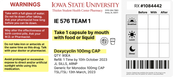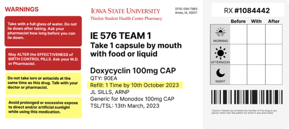
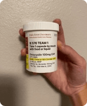
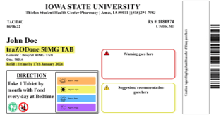

This project aimed to redesign the prescription bottle labels of Thielen Student Health Center Pharmacy at Iowa State University. The objective was to improve label legibility, reduce user errors, and create a user-friendly design that caters to diverse student demographics, including international students and individuals with varying literacy levels.
Medication errors, often caused by unclear packaging and labeling, are a significant concern, with studies reporting that labeling and packaging contribute to 33% of medication errors, including 30% of fatalities. The original label design at Thielen Health Center presented issues such as:
• Small and inconsistent fonts.
• Poor color contrast on warning labels.
• Unclear and cluttered layout, making it difficult for users to identify key information.
• A lack of intuitive design elements like icons or tables.
Prescription Volume:
Over 30,000 prescriptions filled annually, catering to a diverse student population, including international students.
Existing Challenges:
• Complex label layouts.
• Inconsistent fonts and poor contrast.
• Limited accommodation for non-native English speakers or individuals with lower literacy levels.
Research & Literature Review:
• Explored studies on health literacy, usability, and medication errors.
• Identified best practices for label design, such as the use of icons, tables, and consistent fonts.User Interviews:
• Conducted interviews with 7 students (18-36 years) to understand their pain points.
• Analyzed feedback on the original and redesigned labels using a think-aloud protocol.Redesign Iteration:
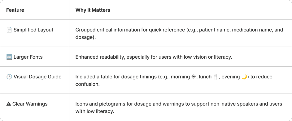
• Grouped key information logically for better readability.
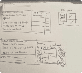
• Introduced a dosage table with intuitive icons (e.g., ☀️ for morning, 🍴 for meals).
• Improved warning labels with larger fonts and higher contrast.
Research:
• Explored academic studies and FDA guidelines on prescription label design.
• Benchmarked designs from major pharmacies like CVS, Walgreens, and Rite Aid.
User Interviews:
• Conducted think-aloud sessions with 7 students aged 18-36 (both domestic and international).
• Gathered feedback on preferences between the original and redesigned labels.
Prototyping:
• Iterated on label designs based on user feedback, focusing on clarity and usability.
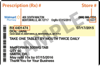
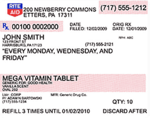

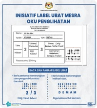
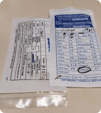
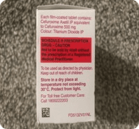
• Compared US labels with designs from countries emphasizing bilingual or icon-driven labeling.
• Highlighted the preference for dual-language instructions.
• Identified effective use of visual elements to guide medication intake.

Results:
• Majority of participants preferred the redesigned label due to its clarity and usability.
• Highlighted areas for further improvement, such as including specific times (e.g., 8 AM) and making the table size more adaptable.
• Suggestions emphasized the inclusion of bilingual labels for international students.
Limitations:
• Small sample size with limited demographic diversity.
• Lack of data from older populations and individuals with low health literacy.
• Restricted access to broader data from the health center.